chart descriptions
using AI, we can now describe charts
…without depending on centralized AIs.
#accessibility #ftw
Here’s a way to add a description to a chart, using AI. We’ll show how to remove that dependency below, but for now, let’s see how neat this is.
Let’s say we have this chart below:
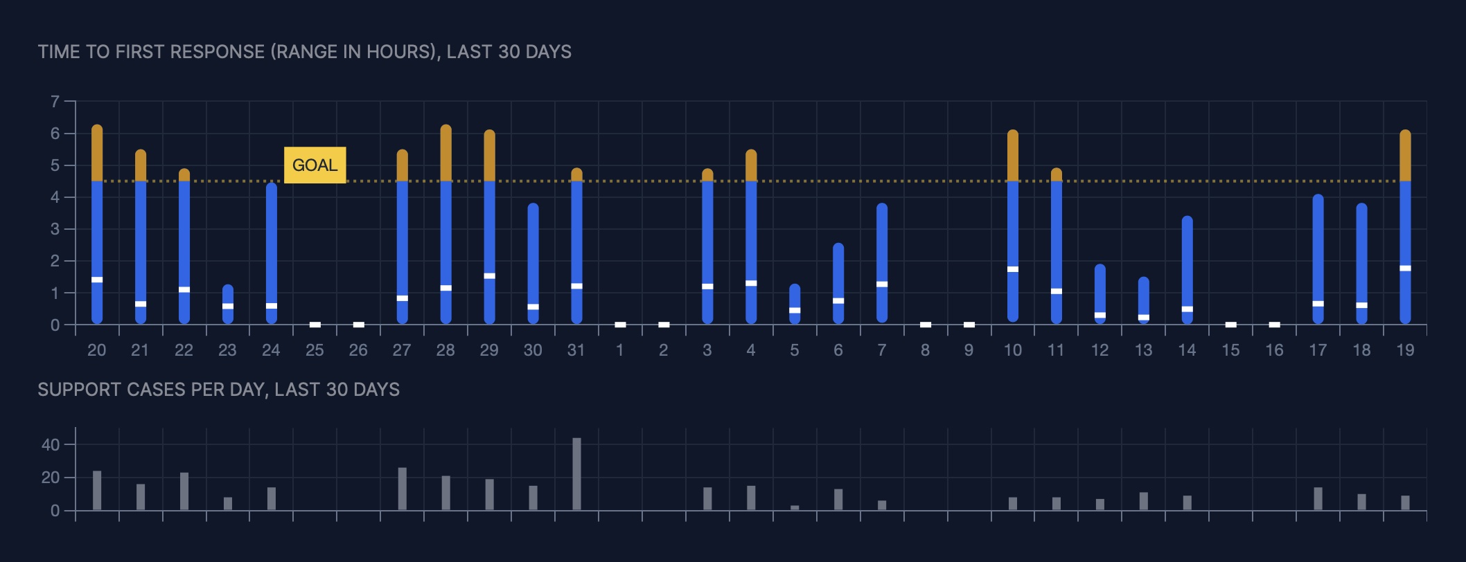
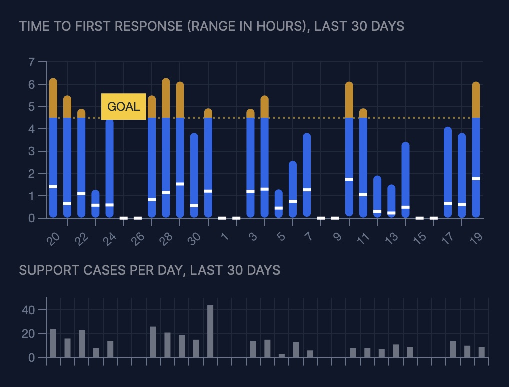
And here’s a description coming from the AI:
Team averaging below 4.5-hour goal, with occasional maximums above 6 hours. No significant increasing trend in past 30 days.
The LLM Prompt to Use: Achieve the Same Thing With Your Chart
We’re using ChatGPT here but I suspect it’ll be the same with any upcoming LLM you can query using an API (ie. new open-source LLMs).
You need to craft a prompt that:
- Instructs the LLM that you’ll be asking to describe data (because data is what the LLM will understand).
- Provides context where the data is used, the type of company you run, what your team wants to achieve and how this chart will be read by your team.
- Gives examples of the types of descriptions you’re looking for.
- Provides the data (here in csv form)
- Specifies a length constraint.
Here’s the prompt:
Please describe the data provided below.
Here’s what the data describes: This data describes the number of support cases per day and the minimum, maximum, and average time to first response (in hours) for each day. The goal column describes the upper limit for the time to first response that the team aims to be under. We’re interested to see if there’s a significant trends or spikes in the averages and maximums, something we should act on.
Here are some 3 examples of what your description could look like. Use them as a guide for length, conciseness, and what we’re concerned with describing:
Team met 4.5-hour first response goal on average. No significant trend, but maximum was 5.2 hours.
Team averaging just below the goal, and maximums ranging too high for most of the past 30 days.
Team average slowly increasing over the past 30 days, same with maximums.
Here’s the data in CSV format:
date_abbr,date_full,count,count_formatted,minimum,maximum,average,goal
20,March 20,24,24,0.0,6.28,1.41,4.5
21,March 21,16,16,0.0,5.5,0.65,4.5
22,March 22,23,23,0.0,4.9,1.1,4.5
23,March 23,8,8,0.0,1.27,0.58,4.5
24,March 24,14,14,0.0,4.46,0.59,4.5
25,March 25,22,22,0.0,6.28,1.83,4.5
26,March 26,18,18,0.0,6.12,1.16,4.5
27,March 27,26,26,0.0,5.5,0.83,4.5
28,March 28,21,21,0.0,6.28,1.15,4.5
29,March 29,19,19,0.01,6.12,1.53,4.5
30,March 30,15,15,0.0,3.82,0.56,4.5
31,March 31,44,44,0.0,4.92,1.21,4.5
1,April  1,16,16,0.0,6.57,1.71,4.5
2,April  2,5,5,0.88,4.9,2.05,4.5
3,April  3,14,14,0.0,4.9,1.2,4.5
4,April  4,15,15,0.0,5.5,1.3,4.5
5,April  5,3,3,0.01,1.29,0.45,4.5
6,April  6,13,13,0.0,2.57,0.75,4.5
7,April  7,6,6,0.06,3.82,1.27,4.5
8,April  8,10,10,0.07,4.1,1.67,4.5
9,April  9,10,10,0.0,5.32,0.74,4.5
10,April 10,8,8,0.08,6.12,1.74,4.5
11,April 11,8,8,0.0,4.92,1.05,4.5
12,April 12,7,7,0.0,1.91,0.3,4.5
13,April 13,11,11,0.0,1.51,0.23,4.5
14,April 14,9,9,0.01,3.42,0.49,4.5
15,April 15,15,15,0.01,6.12,1.4,4.5
16,April 16,8,8,0.0,3.82,0.72,4.5
17,April 17,14,14,0.0,4.1,0.66,4.5
18,April 18,10,10,0.01,3.82,0.61,4.5
19,April 19,9,9,0.0,6.12,1.77,4.5
Can you provide a description of the data using the above examples as a guide? Try keeping it to 20 words or less if possible.
Caveats
- The
gpt-4model or equivalent is the minimum for this to work. - You’re sending data to a privately-owned AI company.
- As of writing, it takes several seconds to get the response.
- You’re relying on a call to the AI each time you update the data. That can get expensive pretty fast.
- There is some variability in how the AI will generate these descriptions. You might get unwanted surprises in the AI’s output which you’ll only know about if reported by a user of your app.
Avoiding Dependence on the AI for Each Call
To avoid the latency, the ballooning costs, the data privacy implications and the unpredictability of the AI’s responses, there’s a way to use AI as a sidekick instead of as a dependence.
Alternative: Write an Algorithm with the Help of an AI
We’ll enlist AI to help us create a “bolted down” algorithm for generating a text description for the majority of the typical chart shapes.
- Explore using the AI the types of descriptions you can generate with different sample charts (and ask the help of the AI to create “examples of CSV data”). Help create a list of the most likely descriptions you could be generating (the 80/20 principle).
- Get the help of the AI to create an algorithm, that is, something in code that does analysis of that chart’s specific data (e.g. to write a ruby class for the above chart like
ChartDescriptions::TimeToFirstResponseChartDescription). It’ll have aanalyze_datamethod and agenerate_descriptionmethod. - Get the help of the AI to create your test suite, where you feed example CSVs and verify the outputs
- Get the help of the AI to make your code look for explicit trends and their appropriate descriptions. When a data set doesn’t match a trend that matches a fitting description, then log the data so you can later improve your algorithm.
I might have more to share on my experiments on this. Sign up to be notified below.
Alternative: First-party LLMs or ML models
The alternative to creating a “bolted down” algorithm for each chart would be to have a first-party general-purpose LLM that your company hosts or a specialized ML model trained just for writing chart descriptions.
The economics will surely become viable soon, but you won’t beat the speed and predictability of an algorithm, and using an AI to help you write it will be an economic and quality leverage for you.
Accessibility Benefits
The ability to generate text-based descriptions of charts has obvious accessibility benefits.
We will soon have the ability to write alt text for visual charts, and that is, with automation. The holy grail is automated, highly-relevant alt text describing a chart in the user’s context.
About me
I’m ![]() Pascal Laliberté, maker of customcharts.dev, a custom chart development service, and supercharts.dev, a way to scaffold charts into your Bullet Train Ruby on Rails app.
Pascal Laliberté, maker of customcharts.dev, a custom chart development service, and supercharts.dev, a way to scaffold charts into your Bullet Train Ruby on Rails app.
Custom Chart Development Services
I can help you create a custom chart or chart description algorithm.
Pre-purchase a week of my availability. Subject to terms described at customcharts.dev.
Get notified
Receive an email when there’s something new here. Spam-free.